Start Designing Young

Every twice in a while, I have to toot the horn for my alma mater.

This time for having a cross disciplinary assignment. Art department meet the Wine Studies and design a wine label. You can read all about the winner right HERE. Readers of the blog know that I love a good design and am equally turned off by bad ones.

And I like this one. Very on point for wine and for classic college, sorry, University.

Cool Labels / Cool Beers – April 2021

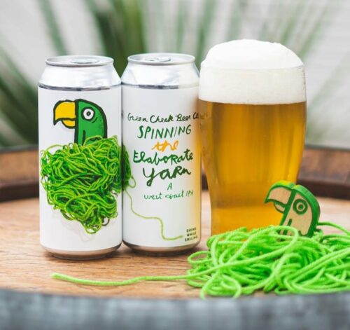
We start with Green Cheek who really have a way with beer names. Spinning the Elaborate Yarn is another winner but the font choice echoes yarn shaping and the colors make this predominantly white can really pop. I also like the “A West Coast IPA”. Just adding the A gives it a little flair.

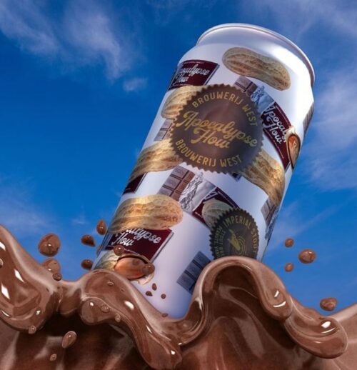
The second cool label is another design win for Brouwerij West….

…another entrant in the growing peanut butter cup beer style if you couldn’t tell from the floating peanuts and chocolate bars.

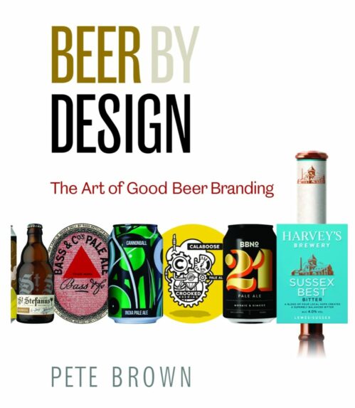
Beer by Design

One of the good things to come of 2020 is that Pete Brown wrote two books! The second is all about branding. Beer by Design talks about design from the marketing and appreciation angle. That last part is key because you can have an effective design but it I should just a literal flash in the pan. The examples shown in the announcement post alone are really cool to look at. Put this on your Christmas list.

What a View

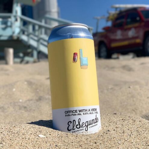
El Segundo has found a winning design template for their latest Tone Series IPAs. I really liked the green of the softball field on a previous can, and now we are treated to the expanse of sand along with a solitary tower and transport. Many are working with new views from home but this one is a great workplace.

Oh, and the beer inside is…

Style: West Coast IPA (obviously)
Hops- LORAL / Centennial / Idaho 7

Sails

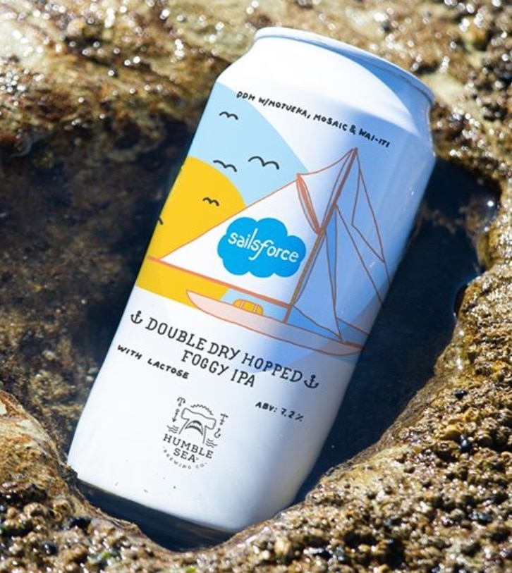
I have heard nothing but good things about Humble Sea beers. Haven’t had more than two if my memory serves. One reason, availability and the other is that their label designs don’t grab my eye, little too reliant on puns and IP. But, this one did. Primarily because my day job has been promising me Salesforce for years, so when I saw this, I chuckled. Plus I should probably have a foggy IPA before they get played out.

Different Gargoyles

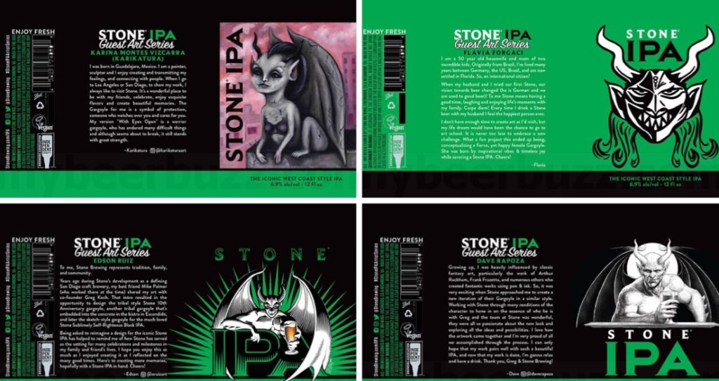
Give an artist their tools and the word “gargoyle” and you will get a spectrum of interpretations. And Stone has given that remit and as you can see from the above, the look varies just a bit. My favorite is the bottom right. It has the strong pose down.

Fun Labels for June 2020

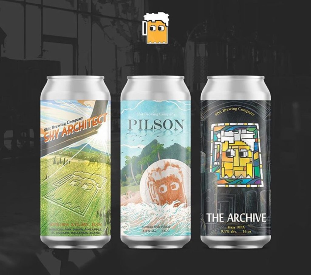
I have visited 8-Bit Brewing Company once and was left giggling over some of their beer names. But I really like the ideas behind the labels on the left and the right, the middle is fine but I am long removed from that Hanks movie so it doesn’t move the needle. I like that the logo is being used in clever ways that loop back into the name. The stained glass effect is particularly well-done.

Fun Beer Names / Labels for May 2020

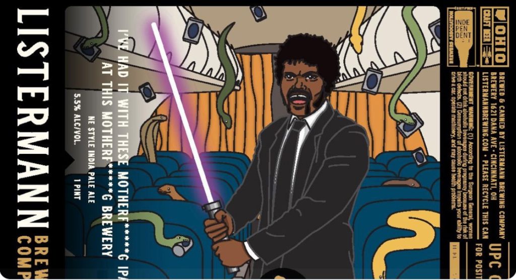
I am not a fan of copyright infringement or cheap branding ideas but I do like the name of this beer from Listermann Brewing Company

…yeah, the image is janky and crossing movie franchises in a bad way but the name is golden. “I’ve had it with these motherfucking IPAs at this motherfucking brewery” is just funny even if hidden in a weird vertical format.

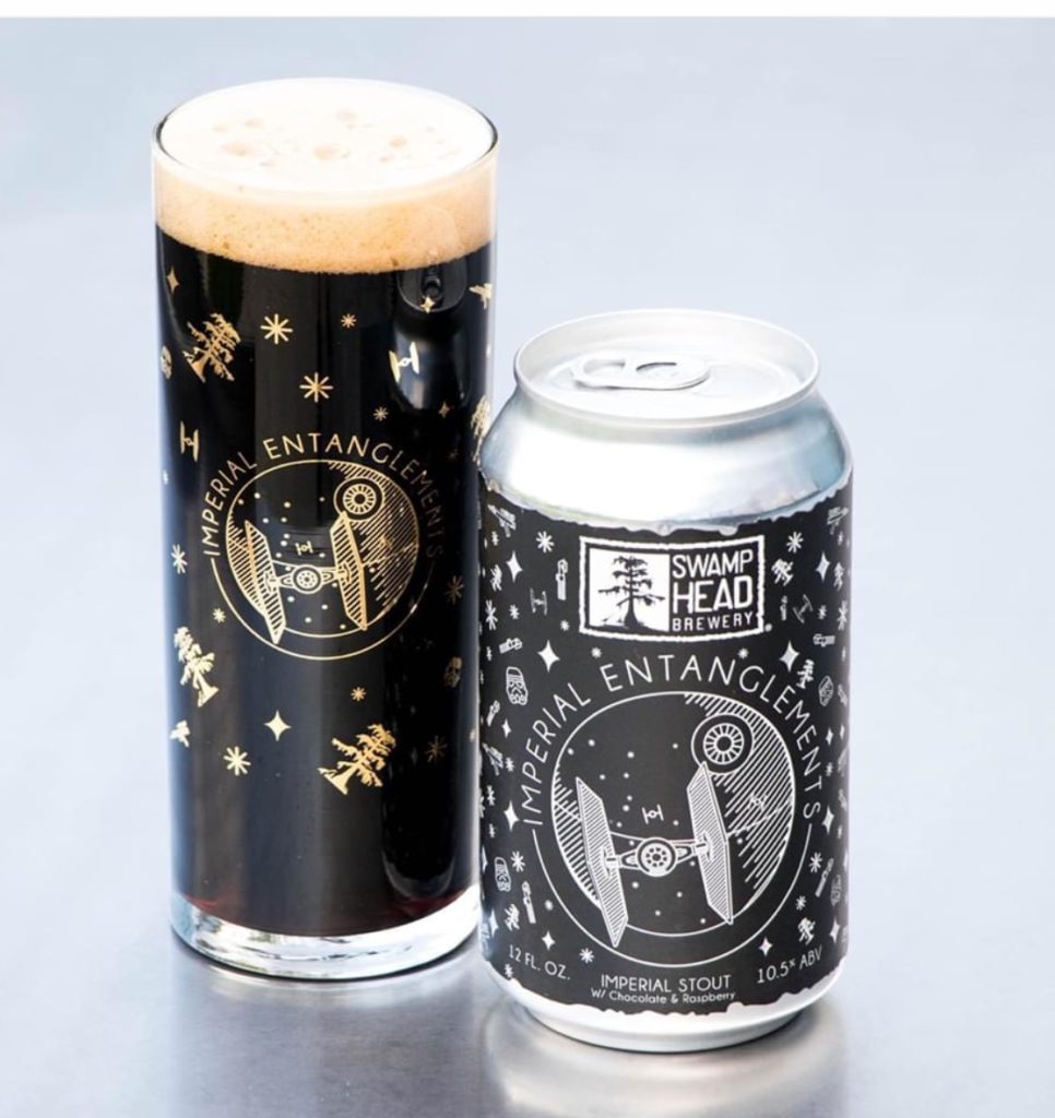
Speaking of lightsabers, a better and fully executed concept comes from Swamp Head Brewery with their Imperial Entanglement…

…brewed for May the Fourth, the design is simple but I really like the addition of their tree logo to the star field and the tie fighter look is retro arcade which is super cool superimposed on the Death Star.

Checkmate

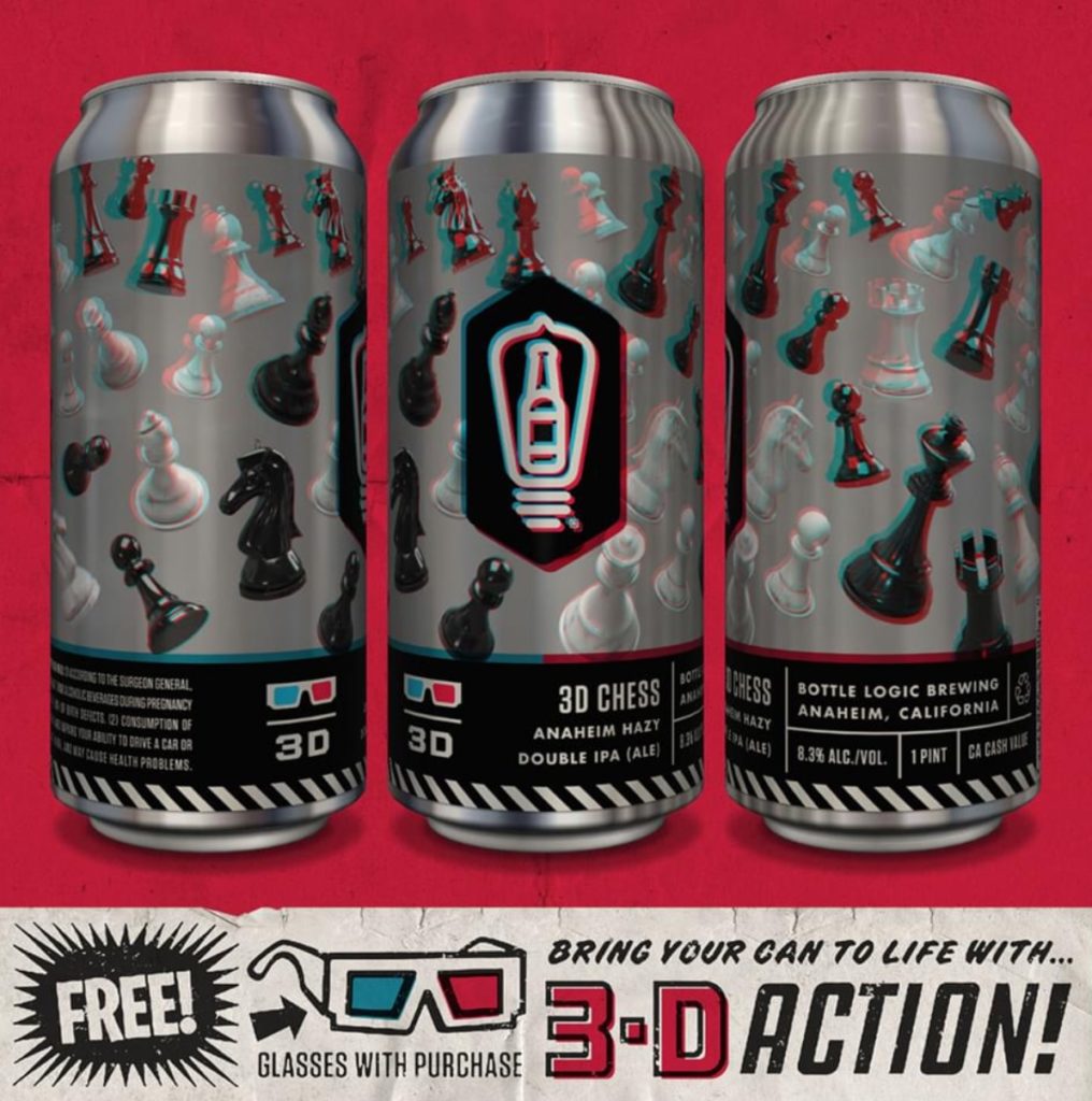
I am not sure what an Anaheim Hazy is but I really do dig the design on these new DIPA cans from Bottle Logic. I think there will be plenty of people sitting at home spending time with 3-D glasses on while enjoying the beer inside the can.