A New Look Fig

Figueroa Mountain has performed a label refresh of their beer line-up and it looks good. Vibrant colors, good font choices and art but take a look at the right side of the line…

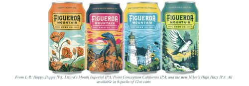
…that is Hiker’s High Hazy IPA – a new “bright and tropical IPA that’s as hazy as those foggy mornings at the top of your favorite peak. The new 6.8% beer is now available in 6-packs of 12oz cans throughout the state”, as well as at their other California locations, my closest is Westlake Village.

Label Art Playoffs

NoHo bottle shop, Hop Merchants harnessed the opinions of the interwebs to determine March Madness bracket style, the best can label currently out there…

I voted in a few of the rounds but my choice did not make it far, instead, the winner was…

…which to me looks more candy wrapper than beer label art. Brouwerij West, El Segundo and others like Highland Park and Los Angeles Ale Works had better art in my humble opinion.

That said, I hope that Hop Merchants does this again next yeat.

LabelWerk

I am a fan of the clever wordplay on a beer label but I truly prefer when it has a second or third layer to it. Hence my enjoyment of…

…Draftwerk from Chapman Crafted. You could just swap the one word out but it is better with the tie design and the beer style choice. Well done to keep pushing the joke.

Fishy

The whole photoshop phishbowl doesn’t do this new Helles Lager label from Brouwerij West justice. Of all the cool BW labels, the fish really pops into three dimensions. The blue rocks at the bottom really tie it together.

Cool Beers and Labels for August 2021

It is hard to keep up with all the new beer releases. Sometimes you just have to filter to style or hop or…

…the color green. It is my wife’s favorite color so it now catches my eye as well and these two LA breweries are using it very well. Crac Brewery has a dramatic two tone look for a Tequila barrel-aged Gose with a clever name. Has a blade like look down the middle which accentuates the font.

Brouwerij West has taken their Popfuji pilsner and brand extended it for the Nelson hop. Replacing the Pop yellow with, again, two-tone green. The slight name change with the color swap is a nice way to create a beer series.

Cool Beers and Cool Labels – July 2021

I am going to reverse tack and talk about a label that doesn’t work for me….

Now the color is fine and I like the verticality in the beer name. But that is really about all I like. Since this is a three part hop harmony, the fact that the other two logos are stuck on a small drum space in black and white irks me especially when the main artistic elements take up space and are not what I call my type of art. Also, what is up with that forested mountain? It seems to be in another style of drawing than the musical birds. Maybe just the penguin playing drums with larger logos would not have been as confusing.

Nick of Time

It is not too often that I can celebrate both a label design and a saison but Brouwerij West can make both happen.

Here are the details… “Time Scoop is a classic non-sour saison, brewed with malted barley, raw spelt, Pacifica and Wai-iti hops from New Zealand. It is full of tropical fruit aroma, fresh sea air and a dry finish that will leave you wanting another of these can conditioned gems.”

Fulton Fog

Readers of the blog know that I am an appreciator of fine label design and that I am wary when a brewery creates a a new brand.

Those two worlds collide with this very strange hazy IPA label from Van Nuys Beer Co. (a MacLeod Ales younger sibling).

The shopping cart plus the fog are creepy and then the yellow dots add a layer of modern art meets Brouwerij West to leave an overall eye catching label. I half expect a grocery bag to be pushed by the wind into the frame and then gust away.