Farm Label

Every once in a while, I shout out cool label designs and Cloudwater of England gets the nod this month with the simple but agriculturally effective photos of hops and the fields that grow them that also includes the hops used in big enough type to read. Below is a closer look…

Log On

I love a great label design and Stillwater Artisanal has a winner that will appeal to the keyboard warriors and day jobbers out there….

Just the little Qwerty business is enough to give a laugh. I don’t know how they chose just one search term for their beer name.

New Union Jack

Breweries are taking the switch to cans as an opportunity to refurbish their label design….

Firestone Walker has Clash-ed up and Anarchy in the UK’d their Union Jack. I think it works with the fighting poses of the Lion and the Bear.

1 Star

I cannot imagine this is the first label that takes reviews and adds them to the can….

Three Magnets has dropped the mic on those who don’t understand Kolsch with 1 Cap. I imagine that those with the bad reviews probably don’t even understand that they are being burned. But then they did order a Kolsch and wonder about the hops.

Brut Magic, Brut Science


The Brouwerij West label design team gets another five-star rating from me. Pairing up with artist BEGZ and the designers at Varnish, the Science Magic Brut IPA is sure to make Jim Gaffigan’s head spin. I bet there is someone out in beer land that has collected all the cans so far from BW. That would be quite the art exhibit.

200 Years in the US


Has it been that long? Not that I was here for all of it but if Guinness says they have been sending us their fine Irish stout for 200 years, then I will believe them. It would have been cool to see the Toucans flying above other American landmarks like the Grand Canyon or the Space Needle, or even the Hollywood Sign, dare I say.

Cheers to the next 200!

Label Review – Fun Light from Noble Ale Works

Not much Noble Ale Works beer makes its way north to Glendale, more canning resources shifted over to the 16oz IPA’s. Though, I must admit that the names are as funny as every.

Speaking of fun, the new can design for their new cream ale is quite good, ditching the hop face creepiness of their hop bombs and instead going for a 1/2 regal and 1/2 Industrial lager look to them. I would have added a little royal purple to the shadow of the word fun to break up the gold but I like the flow of the lines from back to front of the can.

Baja Rebrand


The Donkey is taking center stage as Baja Brewing (friends of the blog) have done the ten year refresh of their label design. Now the donkey will be walking after a beer on all the labels and not just the Cabotella.

Looks good, and I do hope to see more of their beers (with reservations about the raspberry) around L.A.

Hawaiian Re-Brand

Looks like the re-brand bug is more infectious than Zika. Maui Brewing is now unveiling a new look to their cans and while they are cleaner and easier to read, they seem much more generic now. Less Island and more about color coordination.
Capture
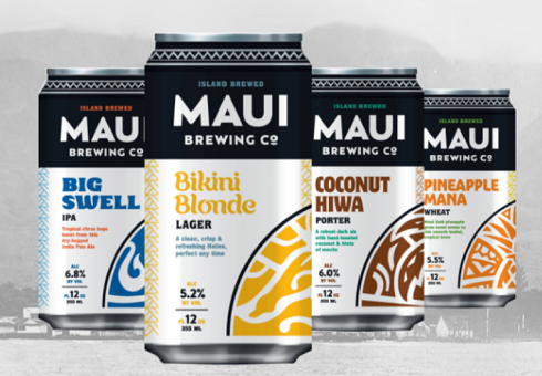
I like the band across the neck of the can and the easy to find ounces and ABV area near the bottom but instead of a generic whirly pattern, I would have kept the logos and designs of the beers already there so that people could see what they have bought before and not have to stop and think about it.

Thumbs down from this blogger.