Design Weisse

Capture
Mikkeller designs for labels and cans are distinctive. I’m not a big fan of the be-hatted person who graces many of the labels but that is a stylistic difference.

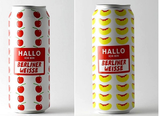
But I am onboard with the new Warhol-ian influenced look of the fruite Berliner Weisse series that they have started up. Almost has a jackpot-casino vibe as well that is cool. The made famous by non-German, very much Irish Kennedy phrasing of “I am a Berliner” is unneeded but the name tag Hallo is quite cool and fits the can well.

The next step being how the beer tastes.

Draw the Label

edr_blank_wdimenstions
I have never been a huge fan of the painted on bottle look from AleSmith (I would describe it as plain and utilitarian) and now if I had any (I mean any) art skills I could do something about it. But maybe someone out in craft beer land will and enter the Evil Dead Red Ale Bottle Art Contest.

Evil Dead Red Ale is an iconic beer on shelves and conjures up all sorts of Halloween imagery and I will be hoping to see not only the winning choice but also the runners-up too to see if I agree with which art makes it on the label.

Artists may submit as many entries as they like to creative@alesmith.com from April 8 to May 9. Check out the AleSmith website for all the rules and regulations.

Submission Period: April 8-May 9, 2016
Winner Announcement: During American Craft Beer Week, May 16-22, 2016

Tip of the Design hat…

It is one thing to design a cool label. But to use three different elements to tie one entire bottle together is a great design and one that get me to look at it on a crowded shelf. The individual beer labels have bold colors that play well against the orange logo and then the protective seal makes the whole shebang look classy and the addition of the risque names really ties it all together.

Kudos to Sound Brewery (where I snagged this photo from) for a great bottle look.