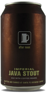
Cheers to Santa Fe Brewing for this great design.

Clean and simple with an appropriate color choice. It is eye catching because it is not trying to beat you over the head with graphics. Just a simple brand logo and a nice counterpoint with the green color on the font.
Oh and the beer sounds delicious too: “This is the kind of beer that gives the word “stout” a reputation. Extra generous quantities of barley malt, followed by vigorous fermentation leaves this “imperial” heavy weight with 8% alcohol A.B.V. and a body as full as chocolate bread pudding. A complimentary and complex array of bitter notes comes form potent American hops, earthy British hops, black-roasted malts and, of course, coffee. Santa Fe Brewing Company uses only top-quality ingredients like organically grown East Timor coffee beans blended with New Guinea coffee beans, locally roasted by O’hori’s Coffee House. Its heavenly flavor and aroma can’t be beat or imitated.”
Will keep an eye out for that one.