
Fieldwork Brewing has a really good design sense. Which is bad, in a way, because now I expect more from them and a new label exceeds even that (with a cool beer name helping as well).
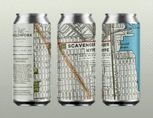
I like the old-timey quality of the map as well as the splashes of green and blue and the stripe of yellow. It is a design that practically forces you to look more closely. A feat many labels cannot achieve. And despite that aged look, we all know from using Google maps what that grid pattern means.