Label Love

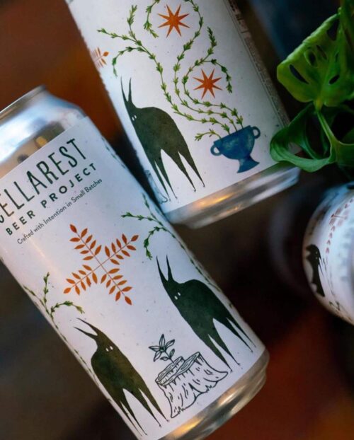
Every once in a while, I like to give some flowers to label designs that show extra effort, are fun and just flat out rise above the cut.

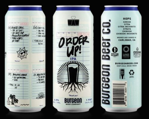
Burgeon Beer Co. takes a diner ticket approach to Order Up.

There are loads of little details. The color is spot on and there is even a binder clip as well. All with enough space and room for the hop bill and the charitable causes logos too. Works on all levels.

Rousing Ovation

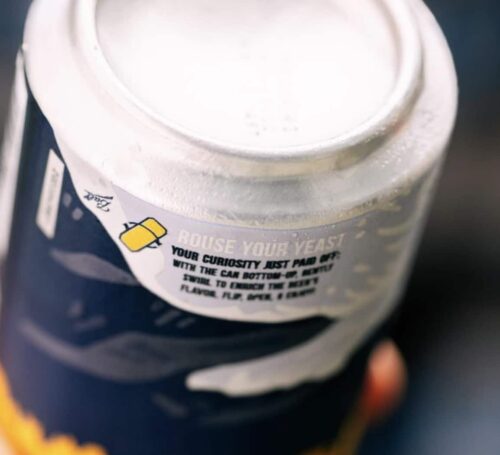
I do like when a beer label has a little fun fact or a hack on it.  Something with a little bit of clever.  Such is the case with Allagash White that makes you give a second look to a classic American beer.

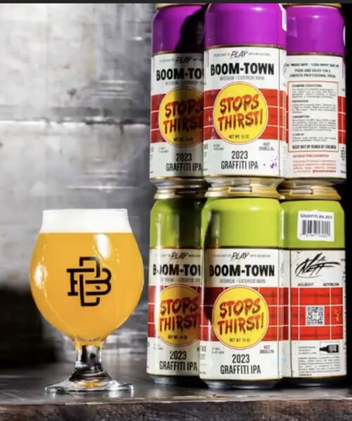
Graffiti 2

Graffiti, the Artist Series DIPA from Boomtown Brewery in DTLA returns in “Purple Plush” or “Guac in the Park Green.” 

It is a “…double dry hopped Hazy DIPA brewed with Galaxy, Cryo Citra & El Dorado hops. Orange and mango on the nose with flavors of guava, mango and resin.”

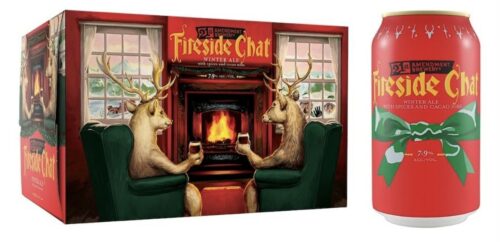
Holiday Cheers – Day 6 – Fireside Chat from 21st Amendment

I gotta say that I much preferred the old label for 21st Amendment’s Fireside Chat. Roosevelt and a fire just seemed right for the season, now reindeer are drinking with their hooves. The bow label on cans and some of the packaging is just boring as well.

“We begin with a rich, deep, toffee-colored winter warmer ale and then we hand-select spices and cocoa nibs until we know we have a beer worth sharing.”

Sleek New Design

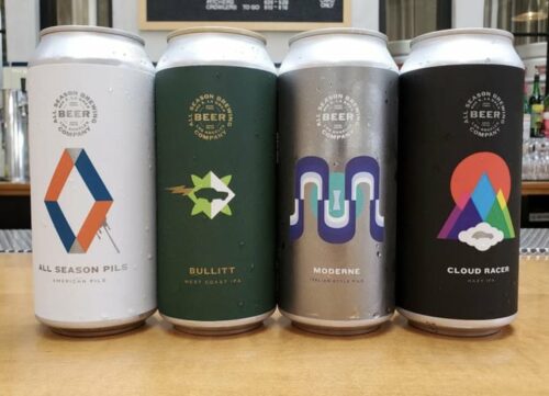
This month, All Season Brewing unveiled their 16oz label designs….

They don’t scream automotive but the names and design look very 60’s mod car design. I like the prominent top of can placement and color variations of the logo. Simple but cool. The award winning Bullitt green cans will look good in the refrigerator.

Look Back, Today

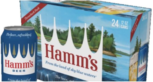
Retro. Obviously said in a Scooby Doo voice. It is usually the domain of the big breweries or even faded regionals like….

But many craft breweries have cycled through multiple branding exercises. Some better than others.  So maybe four-packs if the same beer with different logos could be something for smaller breweries to try out.

Sierra Nevada used their Pale Ale labels in such a way and I thought the effect was great.  You could also highlight the artist or PR firm that executed the design.  Or conduct a vote as to the people’s choice of design for an informal poll.  

Another OR or two here, you could have future designs as well to see which resonates with customers. Or reach into the past and design your label using a 50’s or 70’s look.

Label Insanity

Playing a bit of catch-up here, last month the North Carolina Craft Brewers Guild held their Label Insanity contest.

I think that each brewers guild or as many that want to, should do this so that there could be a giant countrywide competition. What makes this competition good is that they have niche’d it to “insane” instead of best. That choice could allow for a best Halloween or Christmas label as well.

Here is this years winner in North Carolina….

This is How to Label

I am very opinionated when it comes to labels. I have hot takes for days and I do prefer to give a tip of the hat rather than a wag of the finger so let’s look at this label from Burgeon

Instead of hoping to slide IP infringement by, they have used a clever name, a gradation of color and nods to Uncle Owen and Aunt Beru’s homestead. Plus the color has a bit of haze to it to match the beer style.