Facebook can be one long and continuous scroll of the finger through posts that you have already read and movies that Zuckerberg and Co. think you really must see. But on occasion (15% of the time is my guesstimate), you run across a photo that makes you start to scroll back.
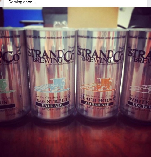
That is what I did when I saw this photo of empty cans of Strand Brewing beers. Now Strand only bottles as of now, so this is news. But since I am not the “extra, extra!” type of blogger, I want to talk a little about the can design.
What I Like!
The different colors to signify each beer.
The font size of the beer style name and the beer name
The Strand logo really pops on the can
What I Don’t Like
The silver is way to reflective and glare causing
The middle logo is nice but maybe bigger to show some detail
A few too many font changes
But I certainly hope to see these cans in stores. Not enough Strand on shelves right now.
