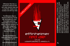
Every twice in awhile, I like to get a little nitpicky about labels. Why? Because there are indeed times when a label is the deciding factor between two unknown beers. Same for tap handles too, by the way.
So first, take a look at this label…

I like the color and the spareness of the label. It is very stark. And upon looking at other bottles in their line it sticks to the brand already established while also being separate from the rest. I like the sash across the top left as well. And the “message” on the far left is legible and nicely worded which some labels should emulate.
I am on the fence about the font. This is a Florida beer with a Louisiana tinge to the name and the modern font doesn’t quite match those two states of mind, as it were.
What I don’t like and what puts this label into negative territory for me is the logo. It matches the font but it goes way to arty for me and not modern but more shapes thrown together.
What do you think? Yea or nay?
(I still want to try their beer though, check out their offerings HERE)

Just found your site, and as a budding beer enthusiast myself, I’ve recently found that label design and graphics have an immense effect on the beers I pick out. I hate to sound so superficial, but let’s face it, it matters. Personally I’m mystified by this label you’ve displayed – no offense to the brewery, but it reeks of amateurism…and if I didn’t know any better, I would think that it was generated in MS Paint, by a 10 year old, no less. I would only find it more off-putting if they used ‘comic sans’ font, although the futuristic font used here isn’t much better.
This could be a mind-blowingly amazing beer, but it would take more than just chance to pick it out at the store. In fact, I would purposefully avoid buying this beer unless it was recommended to me. These guys desperately need to seek out someone with an eye for design to start from scratch on their labels.
I tend to find myself attracted to labels and logos that hearken back to classic or historical designs with continuity across a brewery’s lineup. The history of beer is a strong pull for me, so “modern” logossuch as this (if you could call it that) have zero appeal. Again, this all sounds terribly superficial, but I’ve had this same conversation with friends who admit the same bias. Whether consciously or not, this portion of the subjective process of trying a beer probably weighs heavily in the overall perception and rating of a beer, just as does one’s mood and surroundings.
One brewery with great graphics, in my opinion at least, is Shiner. Their beers are often derided as ‘ sub-craft’ in enthusiast circles, although I’ve generally enjoyed everything I’ve tried from their lineup. Their graphics and labels have improved dramatically in recent years, with a unifying font and layout that is charmingly retro and instantly recognizable. Perhaps some brewers would claim that they are more worried about the taste of their beers than their logos, but I find it to be an integral part of brand appeal and recognition -and it could even play into the psychological aspects of tasting the beer behind the label (as has been proven in wine reviewing).
-Mack
Thanks for writing. After I finished reading your comments, I started to think about how we all make decisions based on visual cues that we don’t even think about. It is interesting to see that we both didn’t like this particular label but for slightly different reasons.