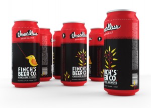
One of the side benefits of traveling in this world of great craft beer is the artwork that you come across. I am usually a fan of minimalist design with colors that are outside the normal palette. Which is why I really liked the design that won for the Threadless IPA.

Finch’s beer got 171 design submissions to grace the can of their IPA. It is a fascinating look at what people think of and can draw to fit on a can of beer. And I like how the design called back to the other cans but wasn’t bound to it. The font for the name is well done too. It has a sewing look to it but it can be read and easily too.
All I can say is, “Put a bird on it”.
