I have been wondering when Brouwerij West was going to take their inventive can label art and push it one step further to interactive….
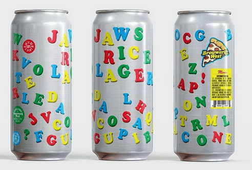
…get your Scrabble skills ready and a 4-pack of a perfect for summer, super light Rice Lager.

Follow Sean Inman to the best in craft beer
I have been wondering when Brouwerij West was going to take their inventive can label art and push it one step further to interactive….
…get your Scrabble skills ready and a 4-pack of a perfect for summer, super light Rice Lager.
Can design has come both a long way and in some instances devolved into IP copycats. And writer Joshua Bernstein has quantified a list of his personal best designs. To his credit, Brouwerij West is on the list for their Falling Water IPA.
Now, I will take the this list and pick my best, worst and almost there…(from left to right in the graphic below)
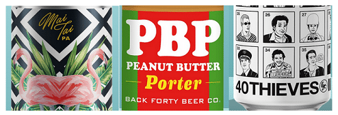
The Alvarado Street design mixes the font, design and name to great effect. It is also of a style that makes you lean in and look at it. The middle design is just flat out lazy to me. The font is as close to generic as possible and it just screams done in a few minutes. The final “close” one is a good idea but the art just doesn’t do it for me. This could be a fun series with different people in each box, heck even employees of the brewery might be fun choices too.
Breweries are not stagnant in beers so the beers label image won’t stand still either. Angel City Brewery has entered the re-branding game for their IPA, DIPA, Pilsner and (my favorite, Sunbather sour).
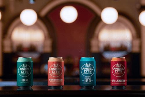
And even though they have developed the can design with Shepard Fairey’s creative agency, SNO, Studio Number One. The results don’t seem edgy or have flair to them at all. Primary colors and a logo. Nothing cutting edge like Brouwerij West or classy like Cellador and certainly nothing that says DTLA or the art around the brewery like the previous designs. Heck, a little IP infringement might even have been in order.
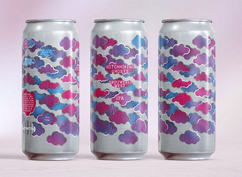
Just when I think that Brouwerij West has made too difficult a label, well, they go and top themselves. This time mauve, pink and blue clouds grace their latest IPA, Hitchhiking Ghosts. Oh and I bet the liquid inside it just as artistic.
One of the side benefits of traveling in this world of great craft beer is the artwork that you come across. I am usually a fan of minimalist design with colors that are outside the normal palette. Which is why I really liked the design that won for the Threadless IPA.

Finch’s beer got 171 design submissions to grace the can of their IPA. It is a fascinating look at what people think of and can draw to fit on a can of beer. And I like how the design called back to the other cans but wasn’t bound to it. The font for the name is well done too. It has a sewing look to it but it can be read and easily too.
All I can say is, “Put a bird on it”.