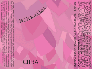
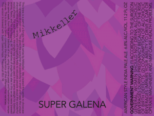
I am a HUGE fan of the Mikkeller Single Hop beers. Don’t believe me? Type Mikkeller into the search box to the left and find out.
But I gotta say that these new labels are not an improvement. The old ones were boring but in line with other Mikkeller beers. These just look a little too computer cute to me. I will still drink them, of course, but it certainly is an odd graphic choice.
What do you think?


