Can design has come both a long way and in some instances devolved into IP copycats. And writer Joshua Bernstein has quantified a list of his personal best designs. To his credit, Brouwerij West is on the list for their Falling Water IPA.
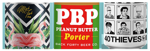
Now, I will take the this list and pick my best, worst and almost there…(from left to right in the graphic below)

The Alvarado Street design mixes the font, design and name to great effect. It is also of a style that makes you lean in and look at it. The middle design is just flat out lazy to me. The font is as close to generic as possible and it just screams done in a few minutes. The final “close” one is a good idea but the art just doesn’t do it for me. This could be a fun series with different people in each box, heck even employees of the brewery might be fun choices too.
