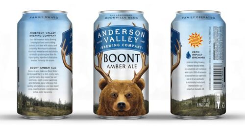
This year Anchor Brewing unveiled a re-branding that didn’t pass muster in many people’s opinion and now another heritage NorCal brewery has done it, but I think that most people will be absolutely fine with the Anderson Valley design changes….

I think the antlered bear is playful and Pixar-ish and I like the forested landscape at the bottom of the label. Having chunks of educational material on either side works for me too. The only mid-step (and it is slight) is the font of the brewery name on the blue banner. I think it is a little plain to my eyes.
This refresh along with plans for a destination taproom shows, to me, that this brewery is giving a good effort to change with the times.
