Canned! Artwork of the Modern American Beer Can really illustrates what a good label and branding can do for a craft beer.
Just go to page 153 to see it. There you will find the first iteration of Dale’s Pale Ale from Oskar Blues. Barely recognizable from what is on shelves today except for the color scheme of blue and red.
That is the strength and weakness of this book. Canning is still young enough to not have a ton of design changes. But those changes that are there chart the growth of craft beer.
Comparing one brewery and their design to another is cool but too many designs are too jokey or too cluttered or the biggest cardinal sin to me, don’t highlight the brewery name enough.
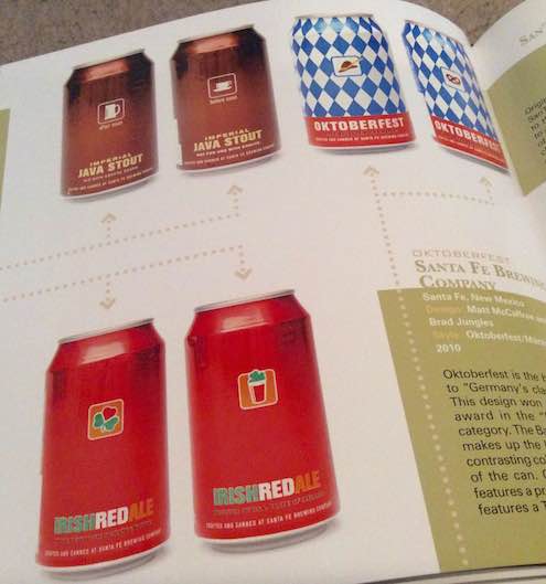
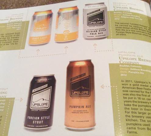
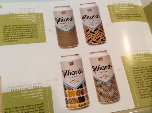
My personal favorites from the book are below:


I almost wish that this was a glossy magazine that appeared quarterly rather than a one-time book. By the time this book was in my hands, more cans and different label designs have been out in the world.
