Angel City – New Look Labels

Angel City has been quietly plugging away in the background of the Los Angeles scene. Sure they have been at the L.A. Beer Week and other events and you can find their beer especially downtown. But the tap room is still in process and the beers and the beer names were in R&D for awhile.

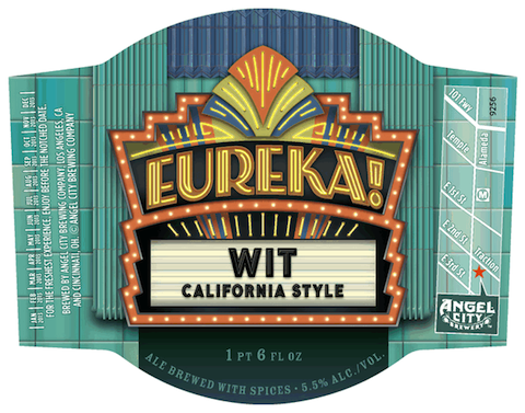
But now, here are some label images for what you will be seeing on store shelves….
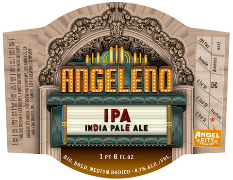

I like that they are evoking the grand movie palaces of downtown with these looks. It ties in with the Hollywood theme and plays nicely with the Angel City logo. All of a retro L.A. Noir piece but with room to grow and be creative.
O’ Canada – Dieu Du Ciel

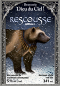
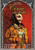
Don’t be scared off by the labels on the Dieu Du Ciel beers. Yes, they are a little freaky but they match the beers quite well.

Here a couple to whet your appetite…

“Corne du diable aka Horn of the Devil IPA is a contemporary interpretation of the classic English India Pale Ale. This new style, born on the west coast of North America, is characterized by stronger and hoppier beers. The result is a red ale expressing caramel flavours coming from the malt, sharp bitterness and powerful hop aromas, thanks to dry hopping”

“La Rescousse (To The Rescue) is a noble Altbier that celebrates life in all its diversity. Malty up front with accents of toasted bread, the well-balanced hops provide a tongue-tingling finish and give this copper ale with mahogany highlights its freshness, complexity and unique character. Dieu du Ciel! Brewers will donate 11 cents for every bottle sold to Fondation de la faune du Québec, in support of efforts to save endangered species such as the wolverine, the copper redhorse, and the western chorus frog. “Liberté, égalité, biodiversité !”

Odd Label Art – March Edition

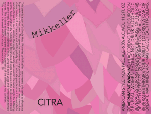
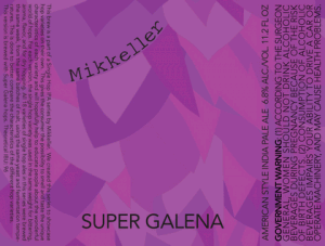
I am a HUGE fan of the Mikkeller Single Hop beers. Don’t believe me? Type Mikkeller into the search box to the left and find out.

But I gotta say that these new labels are not an improvement. The old ones were boring but in line with other Mikkeller beers. These just look a little too computer cute to me. I will still drink them, of course, but it certainly is an odd graphic choice.

What do you think?