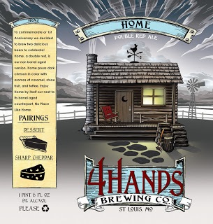
Here is the topic du jour: “On September 2, bloggers from around the world will converge at HopHeadSaid to write about the fabulous world of beer art found on coasters, labels and caps. I am guessing that I am not so different from other beer enthusiasts – I like to collect beer labels, bottle caps and coasters. I think they are perfect souvenirs from beer travels or drinking sessions. Judging by the size of my collection you could say that I have had many enjoyable drinking sessions over the years!
Now it is time to dig through your stash and share your favorite label, coaster or cap art.”
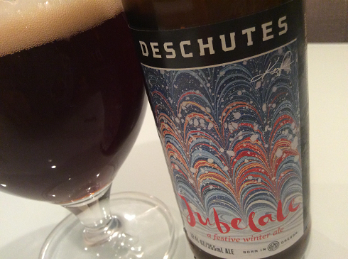
I have a large stash of bottle caps. I have coasters and labels pasted into a scrapbook. So I could theoretically have gone through and picked out my favorites of all three categories and talked about why they caught my eye. Instead I am going to blatantly disregard a part of the instructions and talk cans.
Cans from Fort George Brewery in Astoria, Oregon on the NW coastal tip of the state. I think the design of their Vortex IPA and 1811 Lager not only stand out in a crowd but they also impart visual and written information that you can enjoy while sipping the excellent beer inside. And in 2011, these are the designs that I would put at #1 and # 2 on my “best” of the year list.
First up is 1811 Lager…..

 The light blue on this can is such a different hue from 99% of the bottles and cans you will see. Plus you need to pour it to see the writing correctly. It really makes you look at it and then want to pick it up to see it correctly. And it doesn’t stop there, then you are hooked into reading the dates and events around the rim as well as the story behind the beer and how it is honoring the Astoria Bi-Centennial. Brilliant. Before you realize it the 4-pack will be in your cart.
Second is Vortex IPA…..

 Again, what a bold color choice. Brown and green with a shiny metallic tint to it. But this can brings the focus to a swirling hop tornado logo that ties into the story on the back of the can of how some of the brewing equipment was nearly lost en route to Oregon.
What is amazing is that despite the swirl of colors and mass of words. These do not come across as “too busy” or garish to me. I can’t wait to see further designs from Fort George.