Every twice in awhile, I like to get a little nitpicky about labels. Why? Because there are indeed times when a label is the deciding factor between two unknown beers. Same for tap handles too, by the way.
So first, take a look at this label…

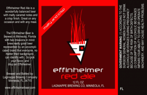
I like the color and the spareness of the label. It is very stark. And upon looking at other bottles in their line it sticks to the brand already established while also being separate from the rest. I like the sash across the top left as well. And the “message” on the far left is legible and nicely worded which some labels should emulate.
I am on the fence about the font. This is a Florida beer with a Louisiana tinge to the name and the modern font doesn’t quite match those two states of mind, as it were.
What I don’t like and what puts this label into negative territory for me is the logo. It matches the font but it goes way to arty for me and not modern but more shapes thrown together.
What do you think? Yea or nay?
(I still want to try their beer though, check out their offerings HERE)


