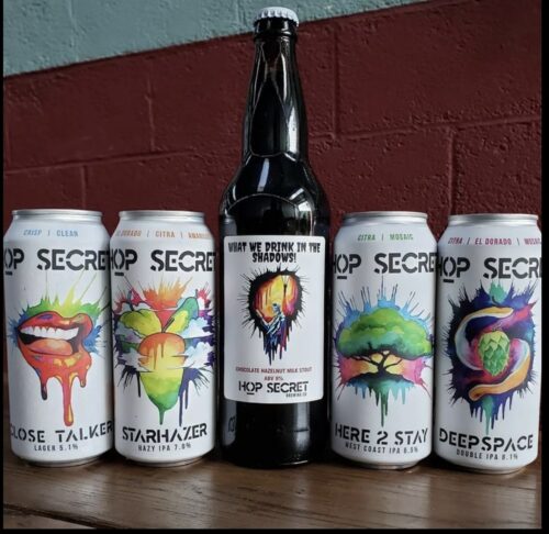
It is no secret that I am an aficionado of label art and I am quick to give a hot take on designs on bottles and cans.
That is all prelude to the fact that I quite like the new direction taken by Hop Secret Brewing of Monrovia…

It’s bright, the font is new and bold and it has a modern art feel to it, though the lips on the left are a little much. I also like the bottle name, a nod to a funny series.
