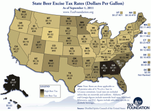
This is one of those fascinating charts that simultaneously explain and confuse. Alaska at #1 in amount of tax, yet Alaskan and Anchorage and others seem to thrive. Conversely, Wyoming at # 50 is not nearly the hotbed that Oregon or Colorado are. And how to explain that Washington and California are pushing forward fast with their mid-pack ranking?

This was sent to me by Steve Zuback who found it HERE.
What conclusions do you draw?
