Cool Labels / Cool Beers for November 2021

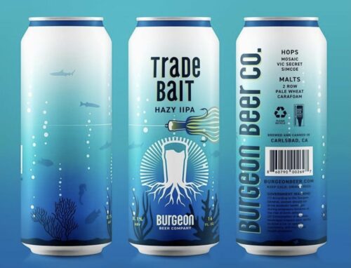
First up is a great combo name from Burgeon Beer...

…covers both fishing and sports in a lovely gradiated blue color.

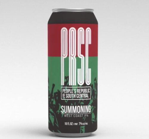
Second up is the 4th PRSC beer, Summoning. The color palette is striking. This is their final release until they open up their tap room next year.

“Our Summoning wrapped aluminum can features the colors of the pan-African flag accompanied by silhouettes of marginalized people coming together to be seen, heard and respected.⁣⁣”

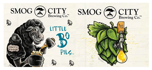
New Bo Pils & IPA


Smog City is refreshing the label look for their two flagship ales. Making their Sheep a little tougher and tapping the hop for all of the lupulin it has inside. I, for one, am looking forward to seeing this in my ‘fridge.

This Land is Belgium

So this came about last week but I wanted to read the insta-responses before posting my own. But I recommend also reading THIS and THAT to get a rounded picture.

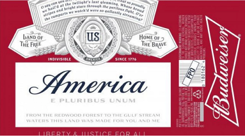
If you base your beer buying choice based on the word America and all the emotions that it evokes. Well then foreign owned Budweiser may have you covered. They have applied for and received special dispensation for a summer season label that swaps out the Budweiser and replaces it with America. As well as whatever other flag draped patriotic words they could find.
budweiser america main (Custom)
And they are truly banking on people buying for that reason only. Maybe Americans will. It has been a weird and wild primary season and I suspect that many a political after-party will have buckets of “America” chilling on ice for the sheer easy-ness of the image that it will send. The flag lapel pin of beer, as it were.

I have my doubts though. Barring cans being emblazoned with first names or photos of Trump or Clinton, what percentage of consumer who already buys this type of beer is basing it on the label? Has there been a study done on it? My gut tells me that the average purchaser will pick on A) price or B) ingrained love/hatred of one brand over another. There might be a group of “undecideds” out there but of them, I again ask, what percentage will pass by reason A on the way to C) that label has America written on it.

I have grown accustomed to the avoidance of the beer inside the container but I also understand that mountains turning blue or a vortex neck might sway people for novelty in ways that a few word choices simply cannot. The cans will be made in far too great a quantity to be collectible though collecting is preferable to drinking them.

Or is this just some psychological experiment from the advertising world? The knowledge that they are a foreign owned company has probably seeped into their customer base and this may just be a way to stop the spread of the pernicious fact based rumor that they are run from Belgium/Brazil. What does it hurt them to slap a few patriotic words on a new label? Probably a drop in the marketing budget. All in exchange for forestalling their sales slide. Blatant misdirection has worked for the Tangerine Terror this political season (see Trump in his own version of 11 22 63). So, why not for America-wiser.

I fully expect to see a Point the Way USA IPA this summer in red, white and blue striped cans. Or perhaps a Patriot’s Peachy Pumpkin from Elysian.

I also fully expect craft brewers to answer this call with patriotic and hoppy puns combined.

Extra El Segundo

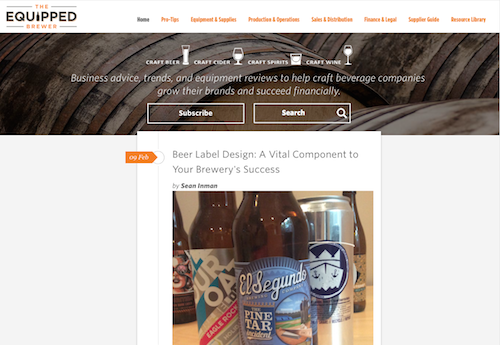
Next month, the Equipped Brewer will be running a post I penned about labels. For that piece, I asked a couple people about label choices and art. One of which was the ever gracious Tom Kelly at El Segundo Brewing.

Even though I asked only a couple specific questions, I still had some leftover material that I think is cool to know. So instead of wasting it, here is some bonus content……

2. How do you incorporate a larger than life (literally) figure like Steve Austin into a beer label?

Well… our first thought was – Put his face on it! He quickly shot that down. Steve is really in the business of sort of re-branding himself with the Broken Skull image, which is also the name of his ranch outside of Austin. On the first iteration of the label we had a silouttte of Texas around the UPC but that was shot down by TTB (Alcohol and Tobacco Trade and Tax Bureau) because it was confusing as to the origin of the product. We tried to stay true to his image, but keep it somewhere within our brand family. If you look at the label, you’ll see its our same die cut, and our logo is up top, but the colors are like a dusty Texas road.

3. How hard is it to come up with a new label?

Sometimes, their easy. For us at least. They are always a lot of work on the designer. Sometimes they take quite a bit of working out. We have a good working relationship with our designer Joe Natoli over at Boiling Point and he has a lot of patience for us, as we make changes etc. Citra – easy.. cool title font, and a hop. Hammerland and Grand Hill – bit more difficult, a lot of back and forth.

Beer Art

Screen Shot 2016-01-21 at 9.08.20 PM
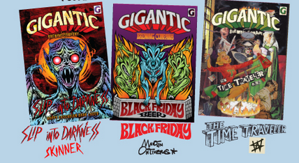
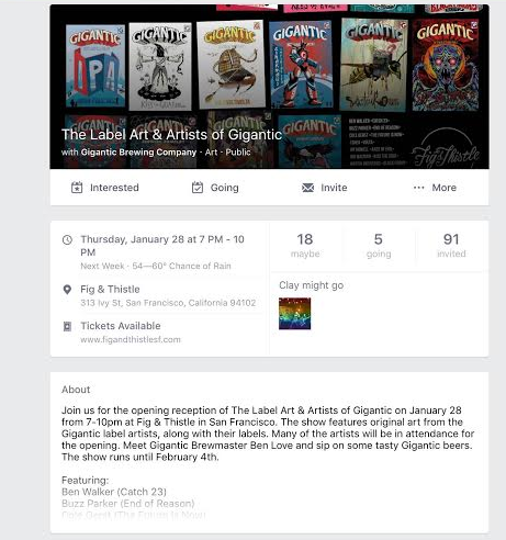
I have been reading and researching about labels this month (and last year) and this event struck me as super cool. And it has nothing to do with the fact that Gigantic Brewing beer is uniformly awesome….
Since the event is in the recent past, I will have to say that I think it would be great for L.A. breweries to bring in the people that design their labels and have an art show.

Even ardent craft beer fans don’t know the creativity, the discussions and the give and take of creating the label that you see on the store shelf. So congrats to the Fig & Thistle, now send the art show south.
Screen Shot 2016-01-21 at 9.00.27 PM

Just Say No?

If you saw the Last Week Tonight clip about Bud Light and their obnoxious Up For Whatever campaign, you are probably still laughing about the “flavor” descriptors used by the actors in the “truthfull” version of the ad.

But after the laughter is done, you are probably left with, like me, head shaking at the continued incompetence of Budweiser and their Belgian/Brazilian overlords.

One could easily pick apart my blog for errors. I would humbly accept any corrections. But that is me, one person, with no separate editor or separate fact checker. Accountable only to me. How though could an ENTIRE marketing department let the Remove NO from your vocabulary for a night tag to pass layer after layer? Are there no women working there? I would have recognized it and I am a white guy. It’s as if they were tossing red meat to John Oliver and his writers.

But that oversightus maximus pales in comparison to the Blue Moon lawsuit. Now, I only know the outlines of this case but it has got frivolous written all over it.

This dude:

A) couldn’t do a cursory Google search which would have led him to the fact that Miller/Coors owns Blue Moon.
B) seemed to like the beer enough to buy it more than once.
C) thinks that big business is a transparent, paternal enterprise.

Only the lawyers are going to win on this case. Captain Oblivious will lose and look like a bigger fool than when he realized that Blue Moon wasn’t his type of “craft” beer. Miller/Coors loses the anonymity that they are clinging onto along with ABInBev for their limping “craft” and foreign brands.

To me, this litigant is more of what’s wrong with craft beer fans than any snob. The all too easily affronted. This subset of people, whether they are comic book fans who decry movies that alter from the course of their beloved books or the Fox News commentator who finds fault in everything that a democrat says push casual fans away from joining the cause with their hyper misguided vigilance.

I need to set-up a Craft Beer – Department of No. People can ask me if an idea is good and I can review and render my judgement. Most answers will be NO.
 

New Look for El Segundo

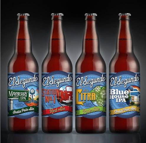
The beers of El Segundo Brewing were always the draw but I couldn’t help but notice that the label design had a huge hole in the middle where a little photo or graphic seemed swallowed up.  The labels were fine but the only one that really “popped” was the autumnal Smoky Hollow beer and the ghostly bagpiper with 3d smoke.  Well, now it is different.  Now they all pop.

IMG_3389

Now both the name and the image are there front and center.  Plus the name font and the beer style font match and pull the eye in.  Plus the color really makes these shelf eye catching compared to the blue and black of before.  Now the outside looks as good as what is inside.

And they have teamed up with Inside the Cellar for Freshies Club. Want fresh Mayberry but can’t brave the traffic to pick up a growler? Then get it home delivered. Much better than the alternative……

Durable Labels

Good looking and professional beer labels can be hard to do for those who brew at home.  Especially when there is spilling and sanitizing and the like.  Plus most prefer to spend their dollars on more equipment or boutique hops and not the art.

Enter: Garage Monk on the Etsy website.

il_570xN.563713423_e8cl

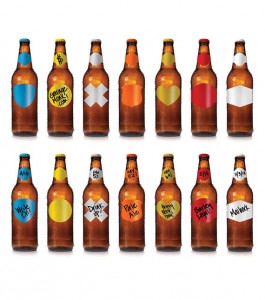
With a line of cool and colorful vinyl labels that can withstand a bit of punishment that a paper label would wilt from.  I like the multiplication X sign myself.