Label Art is subjective. I generally side with the less is more school. I think the Bruery does a great job with their style choices. I like the distinctive B of Brooklyn Brewery. Just two examples off the top of my head.
In my interwebs beer travels, I come across other labels and wonder what the heck is going on? So intermittently, I will post up some labels and make my snarky comments then let the readers take over, if the muse of commenting strikes.
Here is the Craft Beer label discussion – Animal Edition
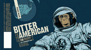
First up is Bitter American from 21st Amendment
I get the whole monkey and space thing. But I can’t quite make the leap from Bitter American to outer space. I am sure there is an explanation but I can’t imagine that it is a simple one. Plus the monkey looks damn old. It looks like the same artist did Fireside Chat and that also looked a little off. Makes you look at it twice. Maybe that was the aim.
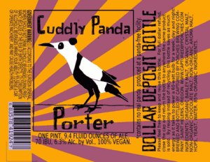
Our second label is from Captured by Porches with Cuddly Panda Porter
I like the bright color palette that CbP uses. But the traditional bird morphed into a bear strikes me as off. Seems a little shoe-horned to me. As in trying to stick with a theme (birds) when maybe a little more change like just a bear drawing would have worked better.
That’s my cockeyed opinion. What say you?

