Label design is tough and I can be a harsh judge. Paperback Brewing has a bold dime store novel cover with super bright colors look that I don’t vibe with but they have a winner with their Surrealist beer…
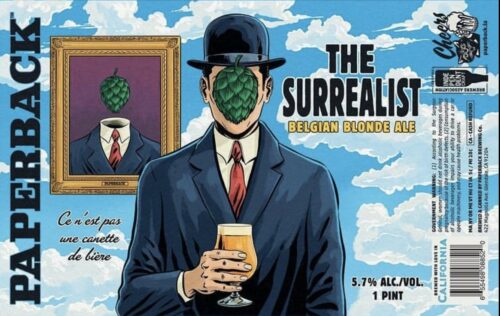
…and it doesn’t hurt that the style of beer is one that I, personally, would like to see more of, the Belgian Blonde ale.