Temescal Brewing has struck upon a simple but effective label for end of year / start of new year beer…
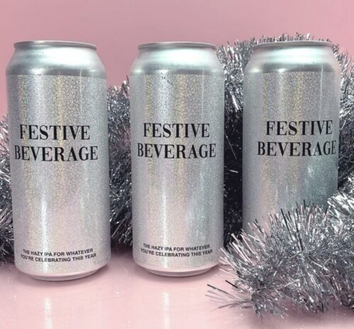
Sparkles, hazy IPA and a very generic name combine for a fun can that would be the hit of the cooler, I think.

Follow Sean Inman to the best in craft beer
Temescal Brewing has struck upon a simple but effective label for end of year / start of new year beer…
Sparkles, hazy IPA and a very generic name combine for a fun can that would be the hit of the cooler, I think.
When I first saw the label below, I thought, “Oh, that’s clever”. But as I nosed around the design, my mind changed.

The name is great but I am just not a fan of the color scheme or the image choices. To spot on is the main problem design wise. I would have gone with a listicle graphic instead with all the problems on it and then added a couple blank lines for customers to write in their own problems with this craptacular year and have them post a photo of it on social media. You could even have a second label done with customer versions.
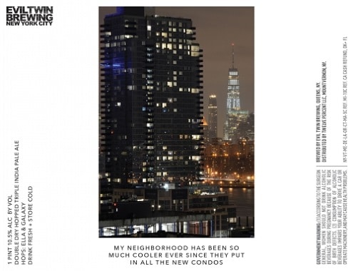
In general, I have not liked the Evil Twin Brewing labels of late. Haven’t seen much on shelves so I can’t really give an opinion on the liquid itself. They have seemed too arch by half or seemed like an in joke that I couldn’t fully grasp.
But the above label hits just the right sarcastic tone for me and though the name doesn’t inform the casual buyer that inside is a Triple IPA, I certainly would like to hand these bottles out to city officials and developers here in Los Angeles who value amenities and high-priced condos over building a wide-range of dwellings.
Not that they would get it but it would make me feel better.
I am, of course, blatantly using the Stephen Colbert phrase unfortunately not in the ironic way that he does though. First take a look at this Smuttynose label…..

Prudish, I am not. But this label weirds me out. In the walking in on your parents way. I can live with the sperm graphics. I can live with the label copy pregnancy puns. But combined with the creepy smiling faces on the sperm just pushes it over the line. And it also intimates that there is something not beer related in my glass.
It may still be an excellent beer and I would not turn it down but I would tear the label off first.