
Some may not like Untappd or Beer Advocate ratings for the tickers or sometimes weird reviews but if you use the services just to measure yourself you might learn a bit. In a nod at transparency and/or education, here is my ratings charted by Untappd…
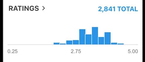
Why, for example are their three towers on my chart right smack dab in the middle? And why is everything bunched up around 2 and up?
I would say that the majority of beers are in the middle of my taste spectrum and that I am pretty damn picky. So there are no drain pours but very little at the far right either. Is this the sign of an intelligent drinker? I would like to think so. But statistics are known to lie. But I encourage all beer searchers to look at how they rate the beers they drink.