
Port Brewing Co. “will change up its original branding of a “port hole” and “pint glass”, to a recognizable icon seen on beaches worldwide, the flip-flop.”
And that branding change will encompass the label designs and the newly refurbished website with the Port motto, “Laid Back but Hop Forward™.”
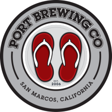
“We’ve been using the Flip-Flop tap handles to brand our draft beer for the past 7 years” said Tomme Arthur Director of Brewery Operations for Port Brewing. “Adding these icons to everything from our new website all the way down to our bottle caps makes perfect sense.”
Agreed. I wasn’t a huge fan of the artwork on some of the bottles and I think a unified image will be better in the long run both artistically and commercially.