
I am going to reverse tack and talk about a label that doesn’t work for me….
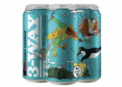
Now the color is fine and I like the verticality in the beer name. But that is really about all I like. Since this is a three part hop harmony, the fact that the other two logos are stuck on a small drum space in black and white irks me especially when the main artistic elements take up space and are not what I call my type of art. Also, what is up with that forested mountain? It seems to be in another style of drawing than the musical birds. Maybe just the penguin playing drums with larger logos would not have been as confusing.