

I am a harsh judge of brand design. I know what I like and only a few breweries win kudos from me on this front. When I heard that the venerable Anchor Steam was getting a make-over, I blanched. The old (current) design is great. Is it in-modern, yeah but it still stands out on shelves.
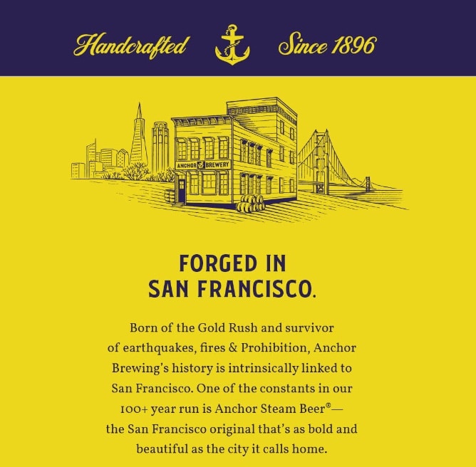
Now we get this yellow/gold look and the art is fine but the color scheme is both too much and too little. Garish brightness and lots of unused space. Maybe this will just be a summer look.